


As you may well know, your website is the centre-piece for your digital marketing. If you’ve implemented a systemised digital marketing approach, then all of your traffic leads back to your website. Your audience heads back to your website after clicking on a post you published on your LinkedIn brand page. Organic traffic finds your website through Google search. Your database makes their way to your website after clicking on a link in the newsletter you just sent them. Hundreds, or hopefully thousands of people are visiting your website each month.
Now the saying goes, never judge a book by it’s cover. But with a website, there is definitely a bit of judging going on. Your website visitors will decide straight away whether your website is worth a sniff. Simply put, if your website looks cheap, bad, dodgy, confusing or is hard to navigate… your website visitors will not hesitate to move onto the next website. They will pass judgment on your website in an instant, so you don’t have long to impress them.
As an absolute baseline, in addition to capturing a visitor’s attention, your website should build credibility and authority for your products or services. But in the same stroke, it should also set your brand apart from the competition. Each company’s brand is unique to them. In a marketplace with so much noise, people are looking for clarity, connection, and alignment. And this is where the great dance between your branding and website design should take place.
Before we jump into some sexy looking website designs to inspire your new or next website, here are some basics your website should have:
It should provide clarity
A website exists for one reason, to help your audience understand who you are and what you offer, and how it can help them.
It resonates with visitors
Your website needs to resonate with your ideal client, which is why it is necessary to have an understanding of who your buyer persona. This then enables your messaging to connect with your visitors in a more human way.
It solves their problem
Your website exists for your potential customers. o show how your business can bridge the gap between their problems and a solution.
It provides a great user experience
Your website needs to be user-friendly. It needs to follow your buyer personas thought pattern closely. As they progress through the website, you want them to be able to naturally flow through the website. Every Call to Action (CTA) should be intuitive, the text should be clear and every section should be carefully considered.
It needs to be fast
People will leave your website if it is slow. Case closed.
If you need to deep-dive the basics of website design in more detail, click here.
Here are a few of my favourite websites that display all of these elements and more. Let me break it down for you.
bear grylls
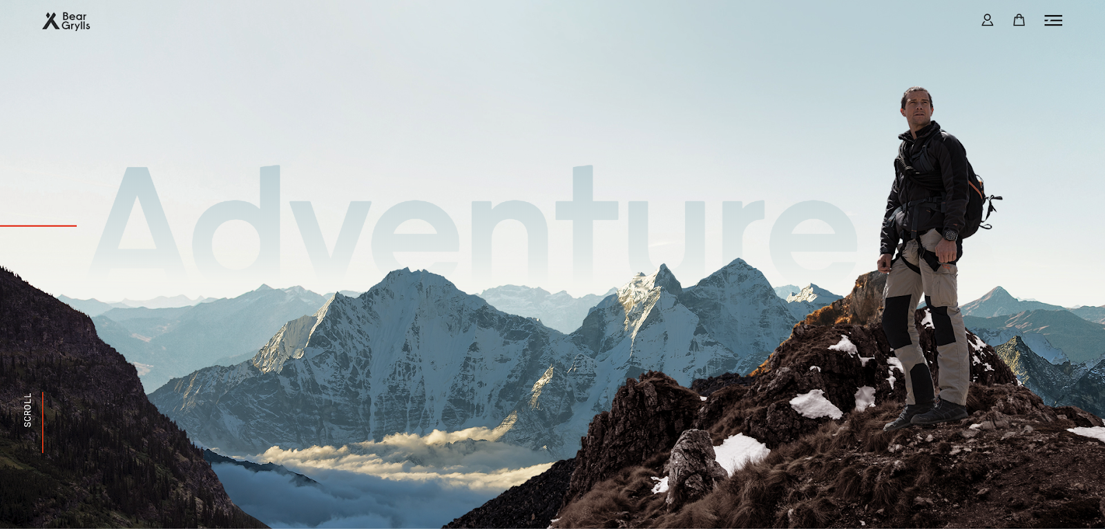
BearGrylls.com is one of my all-time favourite websites. Not only does it feature my childhood hero, but the design and user experience work together harmoniously. This website from start to finish is an experience. It encapsulates the Bear Grylls brand perfectly and is representative of his character. Every single page is consistent, and no section of this website feels shortchanged in terms of functionality.
Websites were not designed to be flat and motionless, well maybe they were 15 years ago. Websites such as Apple have made the use of motion cool. Both Bear Grylls and Apple use something called, semi-flat web design. It is important to mention this because semi-flat uses images layered on top of themselves to create a complex design without all the complicated elements and coding which can cause your website to run slower.
What makes it great:
- Captivating parallax which forces the user to scroll
- Intuitively interactive elements in the website
- Use of contrasting white space and bold imagery
- Consistent tonality which makes the website cohesive
- Encapsulates his brand perfectly
- Bear Grylls (the man, the myth, the legend)
How do I get this for myself:
This website feels complex because of all the movement and interactive elements that feature throughout. But in reality, all it needs is a savvy web designer who understands how to use a tool such as Slider Revolution to create this effect.
Movement doesn’t need to be major. Sometimes the interactions can be micro and still give the same feeling of flow throughout the website.
campos coffee
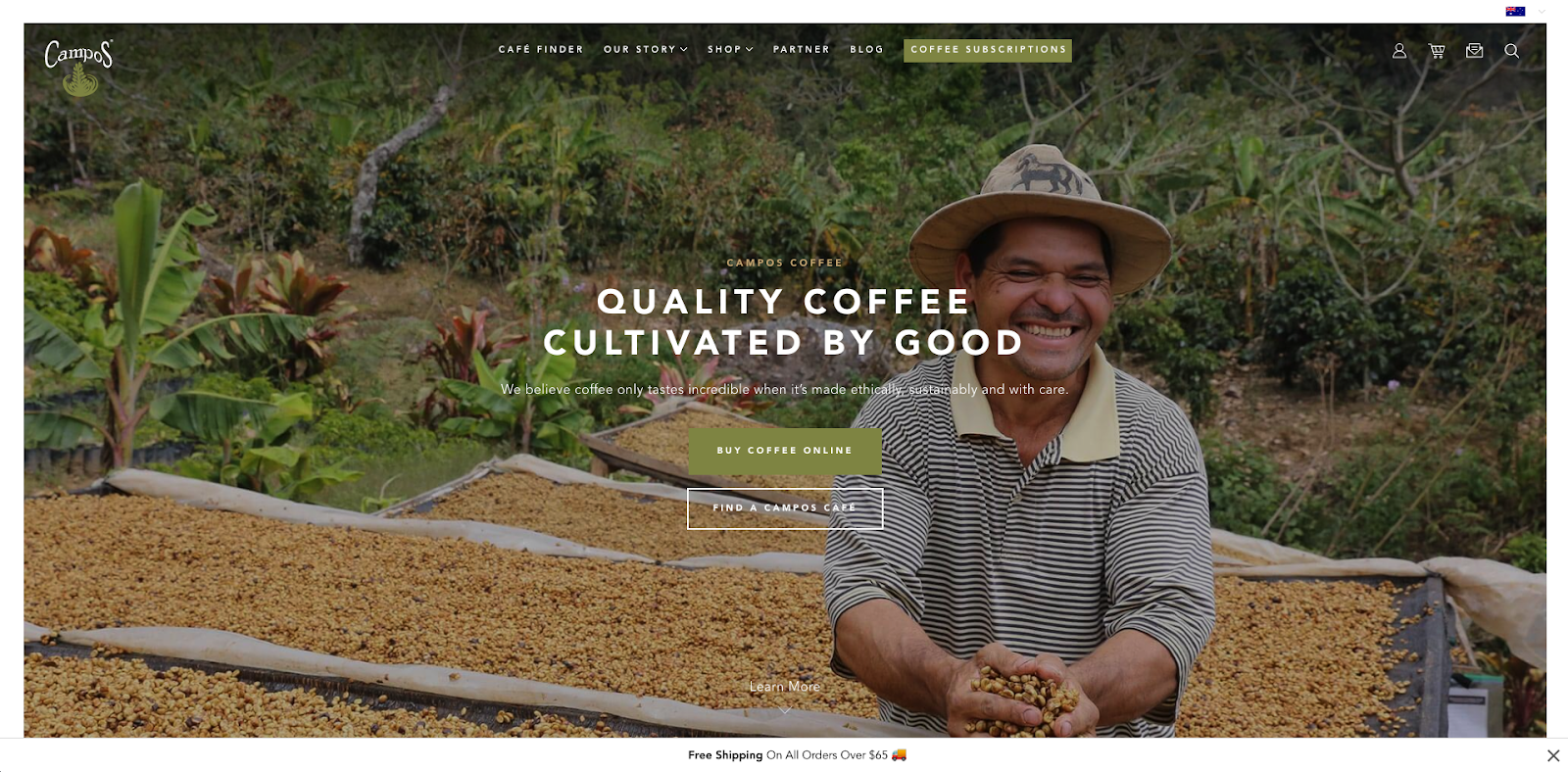
I think CamposCoffee.com deserves a solid round of applause. Their website displays how much this company understands their buyer persona and what matters most to them. This website draws focus to the good work the company is doing and how their customers can rest easy knowing where the coffee they drink comes from.
What really stands out to me about the design of the Campos Coffee website is the use of tonality throughout the website. It supports their brand and creates a calm, supportive environment on every page.
The design of this website feels very fluid and organic with no element out of place.
What makes it great:
- Bold imagery overlayed by text
- Consistent tonality which reflects the brand
- Messaging which is reflective of the audience
- Any element your mouse hovers over is met by a burst of life. This website is interactive and features good movement.
- Oddly placed images that are the opposite of random, broken grids and asymmetrical layers. All these elements are visually delicious to the user.
How to get this for yourself:
Consistency is one of the most important elements of web design, check it out here. One way to make your website look as if it is one flowing work of art is to use consistent tonality throughout. To make sure that your tonality hits the mark. Select a handful of colours that you will use throughout your entire website and define what they will be used for. Will this olive green used for headings or buttons, or for both. Also, be considerate in the selection and editing of the imagery that you use through your website. A very muted pastel pink website is not going to suit a brash high contrast image (unless of course, that’s your brand).
resugraphic
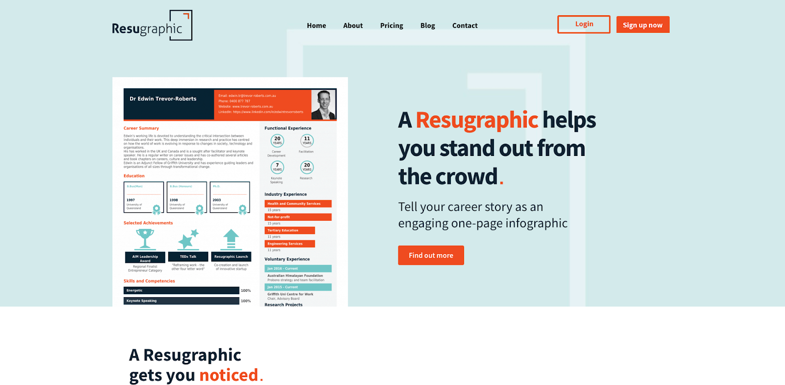
Educating an audience on a new product to a new market is referred to in Marketing 101, as diversification. This is arguably the hardest strategy out there, because not only are you having to educate an audience, you are educating them on a product that they might not even know they need yet. A great way to educate your audience on your product or service is through your website. However, for this same reason, these types of educational websites can be at risk of being too complicated and too overwhelming for the user. So finding the balance between being easy to consume and informative is key.
The Resugraphic website displays all the right cues to educate an audience who currently sits in the diversification audience. It uses captivating visuals that serve to demonstrate to the user how the product actually works. As well as consistent reminders as to what the end product looks like. The Resugraphic website shows the content and happy marriage between user experience and design.
What makes it great:
- Intuitive visual cues that are easy for the user to understand
- Displays the actual end product for the audience to get familiar with before making a purchase decision
- Plenty of movement to keep the website interesting
- Plenty of white space
- Amplifies the brand
How can I get this for myself:
People are fickle, visual creatures. Design and layout have a significant impact on how we understand things and process information. When initially viewing a website, users will often scan the page and see if anything visually interesting catches their attention. Only after something grabs their attention will they start reading. Icons are used in website design to support content and are a great way to communicate information quickly.
Icons work in the same way as a paragraph break. They break up the content and make it less intimidating. So, stop wasting time writing more content than people will actually read and use icons instead.
When designing, perhaps the most important takeaway is to design the website for the user first and SEO second. Too often sites are just designed to rank on page one of Google. And that’s great, but what happens when your potential client lands onto this SEO driven website? Well, they bounce, because the website is unusable. Every second sentence reads Accounting service in Brisbane CBD and the whole website subsequently doesn’t make any sense.
If you need any help designing your website with the user in mind or development itself, contact the team at businessDEPOT Marketing.
Originally authored by Tyson Cobb.