


Do you think your brand looks a little all over the place? Small businesses often can get tempted to add their own creative flair here and there because they feel their brand guidelines are too restrictive, or they feel lost on how to properly execute it. This is detrimental to the value of your brand, or if you would prefer, brand equity. You may not be competing with those big players like McDonald’s and Louis Vuitton (or perhaps you are), but your brand can definitely take a page out of their book of success.
And why does it even matter if your brand is a little inconsistent? After all, a brand shouldn’t be static. We are part of an ever-changing world at the end of the day. But that doesn’t mean it should be constantly changing either. Delivering the same brand from one touchpoint to the next builds all of that good stuff that your business wants; trust, equity, reputation, recognition. Of all the dangers that can come from an inconsistent brand image, the most obvious one should be confusion. The human brain recognises images fast, that means you need to keep the consistency in order to build familiarity with the market.
We all know brand equity, right? You give a customer two cans of soft drink, one is Coca-Cola and the other is just the supermarket brand. You measure a customer’s willingness to choose one product over the other and see how much more they are willing to spend. As of 2018, the value of the Coca-Cola brand is $73.1 billion. How do they do it? Coca-Cola’s brand loyalty is so high that its customers are willing to choose it time and time again over its competitors. But how do you capture this phenomenon for your own brand, products, and services? I’m sure all the articles you read tell you why you need brand equity, but they don’t seem to address how to get it.
how do you get that big brand magic for your brand?
It’s simple. You need to have 3 brand codes. Three is just a general number, you can have less but you shouldn’t ever have more. What is a code? It’s a visual flag that when used together represents the very basics of your brand image.
Pick no more than three codes which you want to be associated with your brand. Notice that some of the biggest brands in the world do this. They aren’t here nor there, they are always consistent and that is what makes their messaging so powerful. Think of McDonald’s, what codes do they use time and time again since you were little? The iconic red, the golden arches and the occasional imagery of people enjoying themselves inside the restaurant. And that’s it…
Now the colour red is not directly associated with McDonald’s, but when used in conjunction with that yellow ‘M’, it is. Piling codes consistently on top of each other is the best brand secret and is the simplest method when producing all your marketing material.
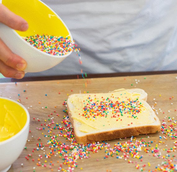
Look at these different advertisements here, they are all different, but they are all similar and importantly, they are recognisable as representing the same product or service and over time individuals will begin to associate this with a certain brand.
I spoke to the Brand Manager who was in charge of Veuve Cliquot. And he said the codes were the colour yellow and the red script. That’s it.

so, what are your brand codes?
This is completely dependent on your brand. It may be a good idea to sit down with your team or have a coffee with a customer and identify what really identifies your brand to others. Is it a tone, is it a texture? A particular image, an icon, a font? Pick two or three of those things and use them consistently from now on, make sure they are on everything that goes out to the public.
Brands lose their way every day. To prevent your brand from losing its way remember to keep it simple and apply those brand codes consistently.
If you need any help with your branding, or perhaps you need a brand style guide or some help kicking things off, contact the team at businessDEPOT Marketing.
Originally authored by Tyson Cobb.